The Market
Role: UX/UI Designer
Team: 1 Designer, 4 Developers
The Why (Problem)
People love farmer’s markets, however they only take place certain days of the week. They are spread out across the county, and during COVID-19, are non-existent.
Time: 3 week sprint
Type: E-Commerce web
The What (Solution)
An online market that allows users to access locally produced foods they love, in a few clicks.
Read on to see how we maintained the user
at the heart of the design process.
Competitive audit: A look at the competitive landscape. We became curious about online food services, looking for both inspiration and insight.
Social listening: Miamians are proud of where they’re from. There’s a movement to support local, a broader movement to #eatlocal, and it’s heightened during COVID-19. This desk research reveals what users are thinking, feeling, and saying on social media platforms.
There’s a sense of social responsibility and pride in shopping locally.
Users of “The Market” will share in this experience.
Survey and focus group: 101 people responded to our survey. This combined with a focus group of 9 individuals, we were better able to understand opinions, and feelings around farmer’s markets and online food services.
Nearly 70% of survey respondents want to see health information while shopping. Health conscious users of “The Market” will have access to the info they desire.
Q:
“What features are attractive to you in an online grocery service?”
Data: Annually in the US, we leave up to 160 billion pounds of food uneaten. This waste occurs throughout our food supply chain.
- Natural Resource Defense Council, 2017
Produce from the local grocery store chain travels an average of 1,500 miles from the farm to your plate.
made with nounproject and keynote
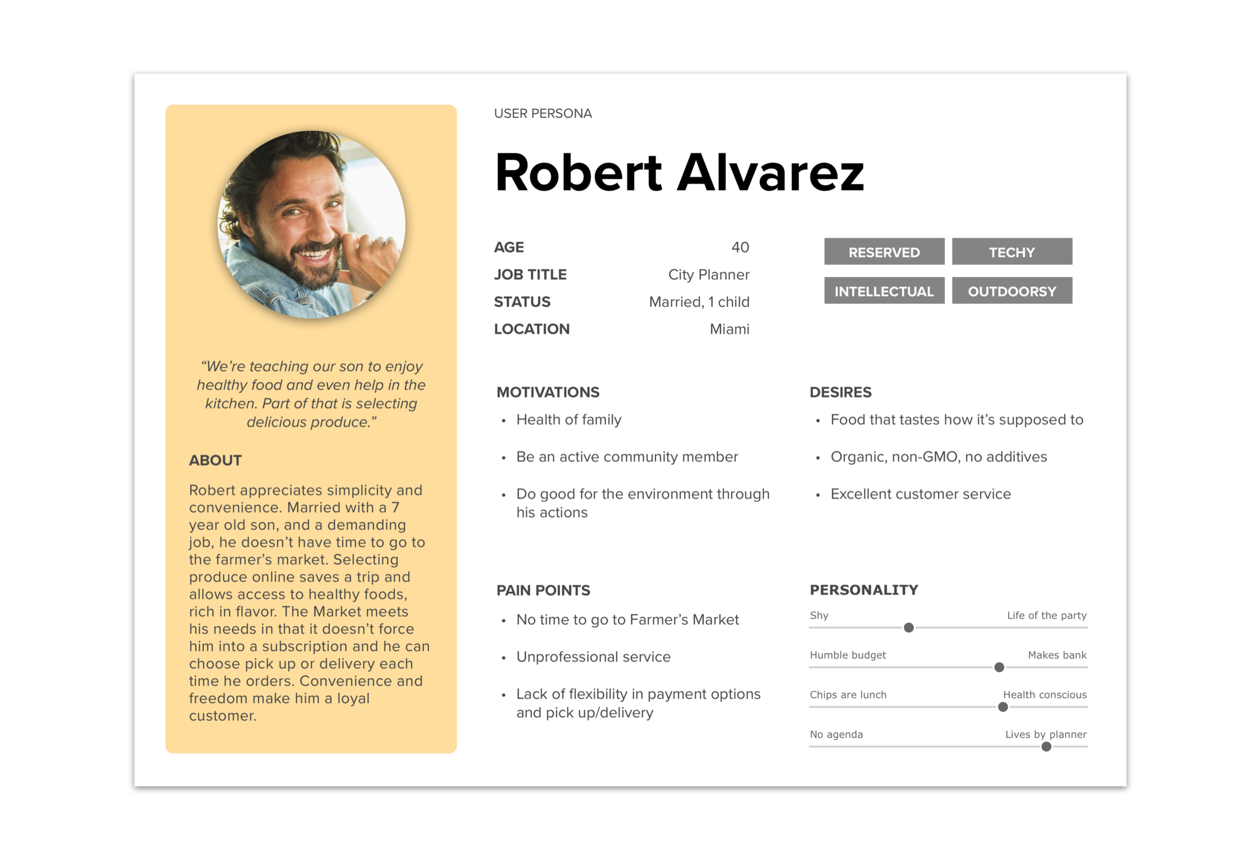
Proto persona: I developed 2 personas to represent a larger group of users with similar demographics, wants, needs and pain points. Allison and Robert became our guides for keeping the focus on the external user. 47% of survey respondents shop for 2, like Allison, while 30% of respondents are a family of 3 or more, like Robert.
Made in Sketch
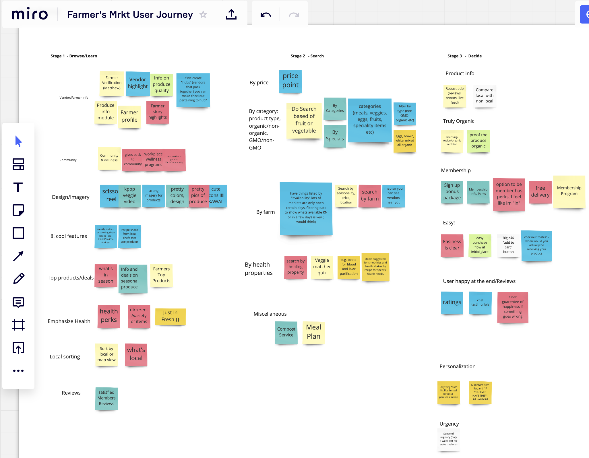
User Journey: The user journey demonstrates how the user interacts with our product, exploring various touch points. In our first meeting with developers, we used the user journey to ideate features for the best possible product for users like Allison and Robert.
Love of post-it notes doesn’t stop during remote collaboration.
All ideas were welcome, refining would come later.
One idea per post -it.
MVP session: During the minimum viable product session with development we discussed key performance indicators, voted on features, and ensured shared understanding. Talking through value and effort, while considering the research, helped us prioritize as a team.
Workshop conducted with Miro
Sitemap: Overview of Information Architecture
Made in Sketch
Flow charts: Early flows help the Dev team and I know what pages will be designed and built out.
Made in Miro
Hand sketches: Grab your sharpie! In this valuable step we brainstorm ways of organizing the information we’ve learned, into effective design. These sketches serve as valuable guides as we move into wireframing.
Wireframes: Solutions in black, white and grey. We’ll use these wires for user testing, to gain meaningful feedback.
Made in Sketch
Moodboard: An inspiration board for visual look, feel and direction.
Product Listing Page Iterations
Made in Figma
Product listing page
Summary:
Pivot - We began with a model that pushed membership and purchase of semi-customizable boxes. A key stakeholder, the woman who created the concept, requested that rather than boxes which require a minimum price point, we allow shoppers freedom to select items as they wish.
Search bar - Version 3.1 shows a search bar which was ultimately removed. As seen in competitive audit, large scale services such as Instacart & Amazon Fresh do include search bars, while services similar to ours, serving a local area, do not include search bars. We decided to remove search since our products are seasonal, we didn’t want users searching only to turn up an empty results page.
Item display - Note the variations the item display went through, users ultimately preferred the layout in the final version with card style background removed.
The Product Listing Page evolved into this final version with the following user feedback incorporated.
Designed in Sketch
The Product Detail Page was an opportunity for fresh design and fun. We engage the user with information they told us they want. It’s just kale, but really it’s so much more…
Designed in Sketch
Designed in Sketch
High fidelity mockups - final screens
Designed in Sketch
Responsive design: 74% of people are likely to return to a website if it is optimized for mobile and 50% of e-commerce revenue is from mobile. It’s clear our product must be mobile (and tablet) responsive. Here are some examples of the checkout experience on mobile.
Stats via: Truelist & Red Website design
User Flows: User action and system response with annotations.
Made with Overflow
Handoff files:
Original files and various formats were packaged in folders, complete with a ‘read-me’ file.
Design System Management
Colors. typography, symbols, and all assets were documented in InVisions’s DSM.
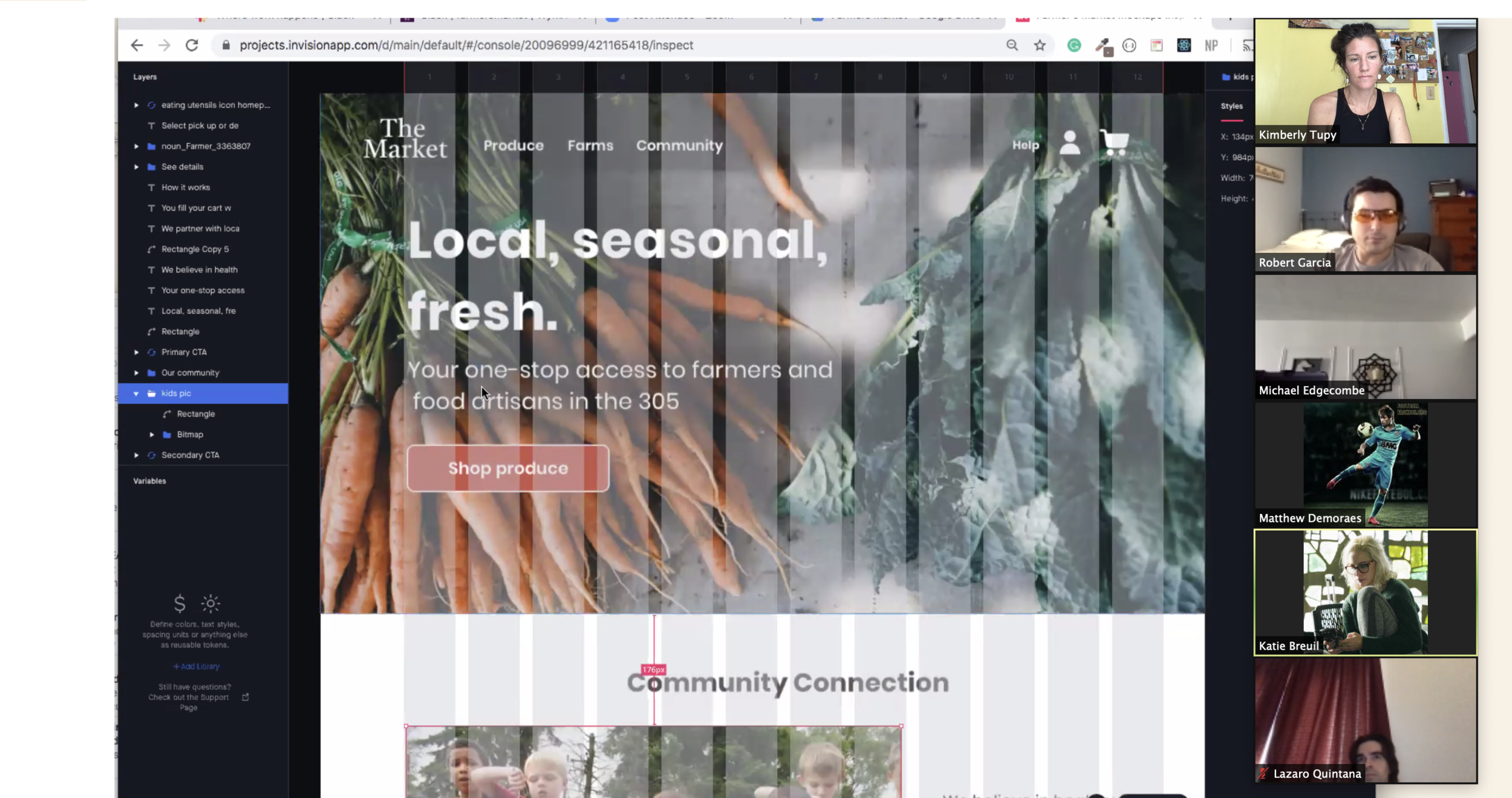
InVision Inspect:
Reviewing Inspect tool with Development.
Sneak peek from development team!
What’s next? Can’t wait to order your veggies right?
While this concludes the case study, I’d like to share with you some of the ideas that didn’t make it past our minimum viable product session:
Push notifications to inform you when your favorite farmers have extra or new inventory.
More emphasis on creating access to healthy foods for communities considered food desserts.
A map of the region and farmer locations.
Designing and building out the community page which holds ‘About us,’ ‘Volunteer opportunities’ & ‘Workplace wellness.’
Thanks for reading. Feel free to reach out to me for more information or with feedback.


