Luz Yoga
Role: Business concept + UX/UI Designer
Team: 2 Designers
Problem:
The current market of yoga mat straps has focused on cheap, simple design, almost like a forgotten, yet commonly used, accessory for yogis. Current products are not aesthetically pleasing, nor unique. They slip out of place and the material often leads to discomfort on the shoulder or damage to the mat.
Type: E-commerce mobile website
Timeframe: 2 weeks
Solution:
Our e-commerce mobile website will communicate the superior quality of ethically handmade yoga mat straps. They come in a variety of styles and the soft yet strong material offers comfort and secures in place in use, and in storage. Additionally they are durable, easy to use, and washable. Our success will be measured by sales and in conversion of visitors to the site who successfully complete a purchase.
Beautiful accessories demand a beautiful website.
We set out to do nothing less.
These yoga mat straps are handmade in Colombia by the Wayuu indigenous people.
We honor tradition, culture and artisanship.
Designed in Adobe XD
So, let’s get to work.
The Framework
Bend, twist and move with us through these steps of our design framework. Let’s begin.
Made in Adobe XD
First, learn.
Research and discover as much as possible about the topic. Look at the landscape of competition. Get to know our users, in this case yogis, their wants, needs, and pain points. Tasks completed were a competitive audit, social listening, a survey and 1 on 1 interviews.
Is yoga even popular anymore?
Yes. About 36 million Americans practice yoga, spending $16 billion on classes, equipment, and accessories each year.
-Yoga Alliance
Do people even care about ethically made products?
Yes. 80% of survey respondents choose ‘ethically made’ products over ‘conventional’ either often or always.
Yogis have good hearts and want the highest good for all beings.
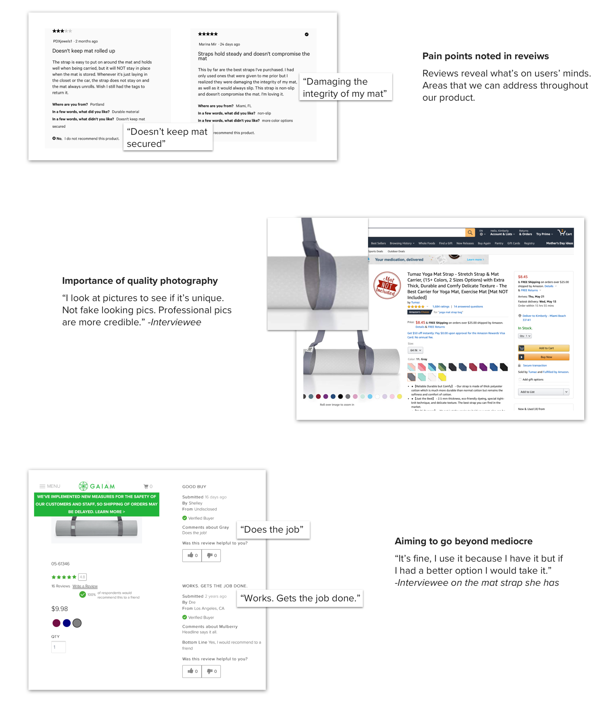
Competitive audit and social listening We looked at other yoga brands, Amazon, and stores that have one key product, like our mat strap, which comes in various styles. We scoured sites and social media for user reviews, loves, likes and dislikes.
Survey and 1:1 Interviews using google forms we conducted a survey of 118 yogis. The 1 on 1 interviews confirmed what was seen through the survey as well as in the competitive audit and social listening. Together this provided a wealth of insight into gaps in current products and what users desire.
Survey says…
Made in Sketch
Next, define.
With knowledge gained from the learn phase, we now empathize and define goals. We strategize for the best solutions with an understanding of both the industry and the people we are designing for.
Personas We created personas to keep us focused on who we’re designing for. The number of men practicing yoga increased by 150% in 4 years. (Yoga Alliance, 2016) Chris is representing this subset of users.
Designed in Sketch
Meet Christy, persona created by my partner Amy Nguyen.
My partner and I used Miro to collaborate. Here’s a peek at our shared board.
Sitemap: Proposed information architecture for our website. Note that for the scope of this project we would only be designing out the pages shown as “active,”
Created in Sketch
UX Strategy: We developed “from-to” statements as our guiding principles. These statements illustrate how interaction with our product will shift the user from unpleasant/mediocre experiences to delightful experiences. This will make them loyal customers who not only shop for themselves, but tell friends and family about us, who post on social media with a sense of pride in being our customer.
Then, design.
Grab your sharpie and start sketching! Designing with the user front and center, we start with lo-fidelity hand sketches and move into hi-fidelity wireframes.
Hand Sketches:
Wireframe Prototypes: Wireframes were created and tested with users to move us towards the best functionality.
Add to cart flow
Made with Cloud app & Keynote
Checkout flow
Made with Cloud app & Keynote
Moodboard:
Made in Adobe XD
Now, experiment and iterate
We test wireframes of the product to get user feedback and move closer towards the truth about the best features, ideas and functionality. Testing often and early helps us create new, much improved, iterations.
Order summary iterations
Designed in Adobe XD
Menu iterations - what is the users view and what are their options when they tap the hamburger menu?
Designed in Adobe XD
Product detail page iterations
Designed in Adobe XD
Homepage iterations: What does the homepage look like? Many days and nights were spent asking myself this. I felt the pressure of importance of this for a few reasons:
5 second test. Will the user arrive here and know what we are offering and what we’re about in 5 seconds or less? If not, we need to do better.
UX Law of Aesthetic Usability - if it looks better, users perceive it working better.
Designed in Adobe XD
Final wireframes
Designed in Adobe XD
Designed in Adobe XD
Finally, Launch
For this case study we are in the launch process. I’ll be working with developers to bring these designs to life. One tool to assist handoff to development is a style guide. See the style guide below defining colors, text styles, buttons, and iconography.
Come back soon for the live link so you can buy your own handmade mat strap. Thanks for reading.
Style guide


